Suppliers told us they want an easier way to keep track of their activity, demonstrate the value of their community work and share examples with buyers and colleagues.
In January, we’re introducing a set of new features to help make that possible. These include AI-assisted case studies, supplier landing pages and three dashboards covering activity, impact and performance.
Turn completed projects into case studies
Completed projects hold useful information about the work suppliers deliver and the difference it makes to community organisations. But turning that information into a case study can take time, and the task often gets pushed down the list.
The new case-study feature will use completed project details, activities and authority-approved feedback to create an editable first draft. Suppliers can review the content, make changes and regenerate individual sections before deciding what to publish.
Case studies can also reflect your business branding, with the option to upload your company logo and choose a colour theme. Before anything goes public, you can share a preview link, PDF or text file with your marketing team and other colleagues for feedback.
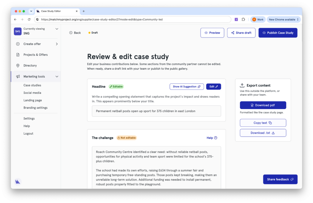
You’ll remain in control of where each case study appears. Publish selected stories on Match My Project and your supplier landing page, or keep them unpublished and share them internally or through an unlisted link. You can edit, unpublish or delete case studies at any time. There will also be an option to create a draft LinkedIn post from a completed case study.
Give buyers one place to see your work
The new supplier landing page will bring selected case studies together under one shareable link.
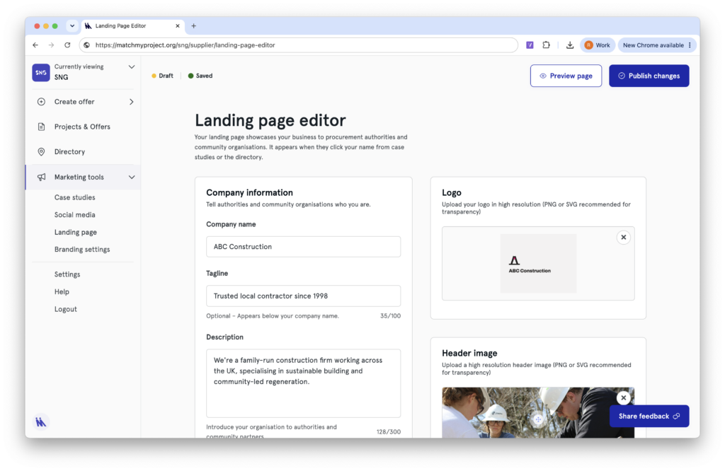
Rather than searching through individual project examples, buyers, colleagues and other stakeholders will have one place to see the community work your business has delivered. You choose which case studies to feature and can update the page as your work develops.
Keep track of what needs attention
When suppliers are working across several authorities and projects, it can be difficult to keep on top of outstanding actions.
The new Activity dashboard will bring these into one view, grouped by authority and showing who each action is with. You’ll be able to see what needs your attention, either across your whole team or assigned to an individual.
See the value of your completed work
The Impact dashboard will bring together information from completed matches, helping you understand and evidence what your business has contributed.
It will show totals for donations, materials, salary value, hours delivered, VCFSEs supported, jobs and training. You’ll also be able to explore results by project, offer, outcome, location and authority, filter by financial year and export the views you need.
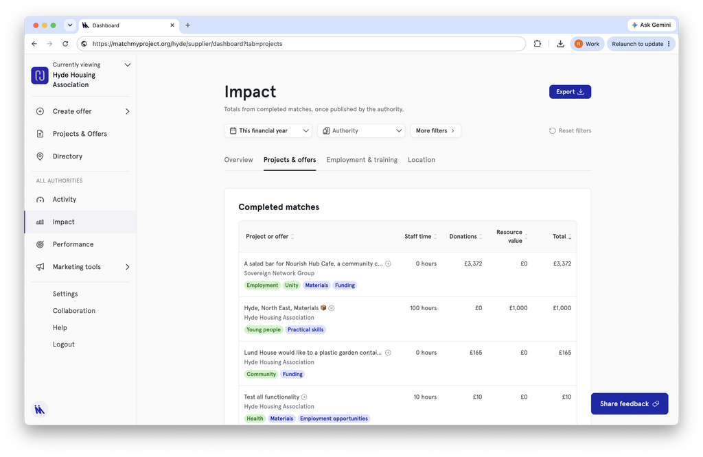
Figures will reflect completed matches once they have been published by the authority.
Understand your performance over time
The Performance dashboard will give you a broader view of how your activity is developing.
You’ll be able to see your completed matches and leaderboard points against your own best quarter, alongside a monthly snapshot of offers made, projects completed, case studies created and active team members. A 12-month view will also compare your matches by type with the supplier average.
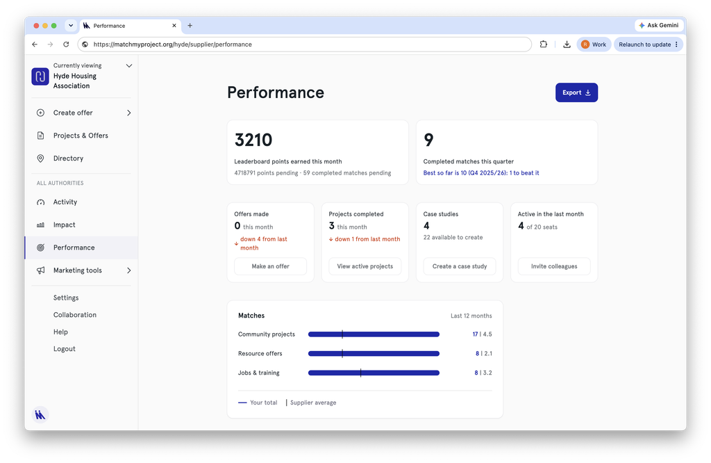
Together, these dashboards will help you see what your team has delivered, what still needs action and how your activity is changing over time.
These features are being introduced to make it easier to manage your Match My Project activity, make better use of the work you have already completed and communicate its value to others.
Practical Social Value ideas, once a month
Get useful guidance, community stories and updates from across the Match My Project network.
Choose the newsletter most relevant to you:
By subscribing, you agree to receive the selected monthly newsletter. You can unsubscribe or change your preferences at any time.